Sisters That Cook: An Elegant and Playful Approach to Branding & Packaging
Branding & Packaging Design
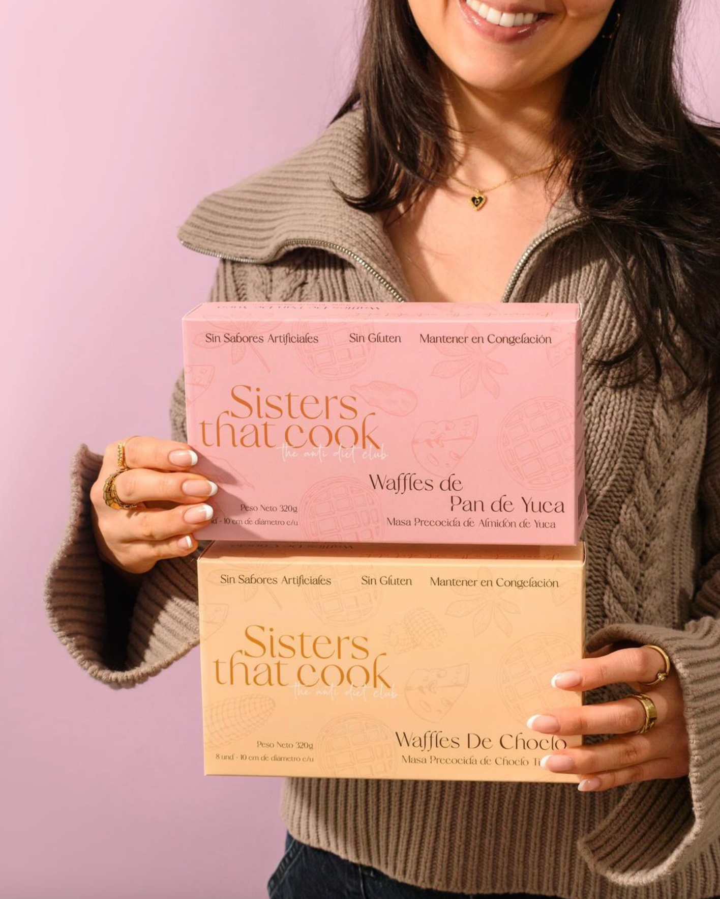
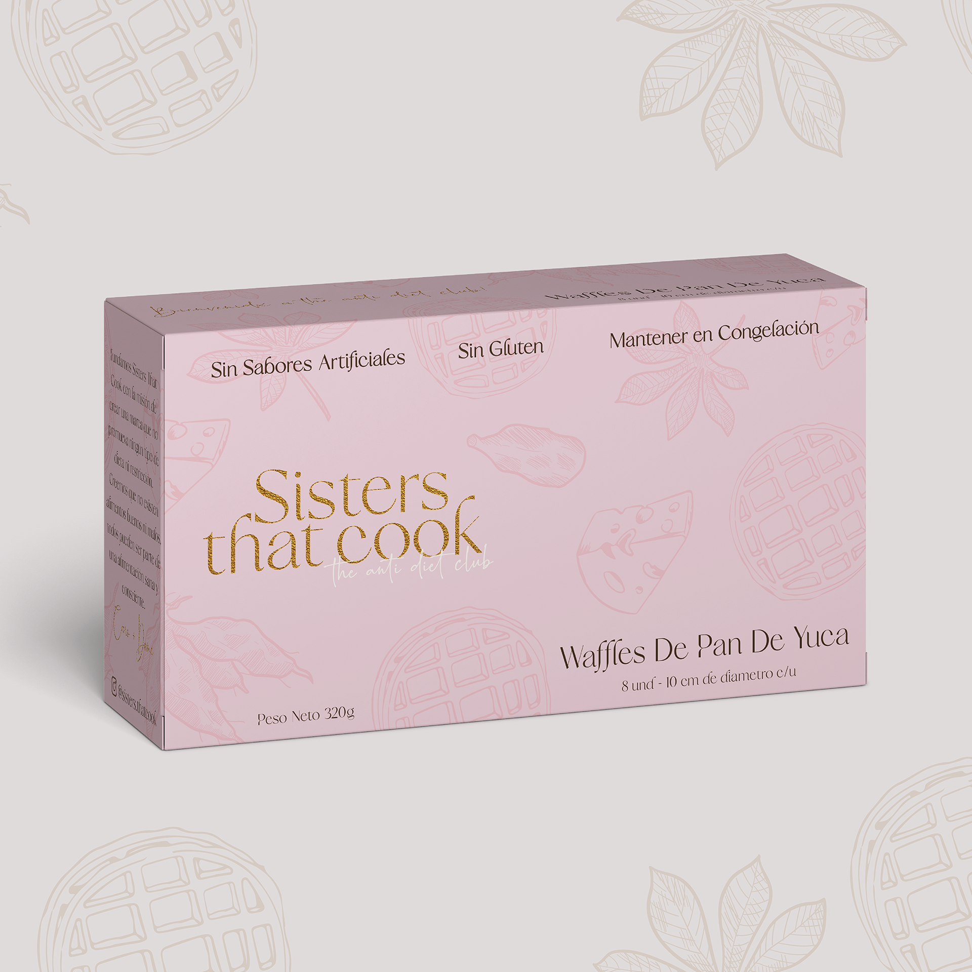
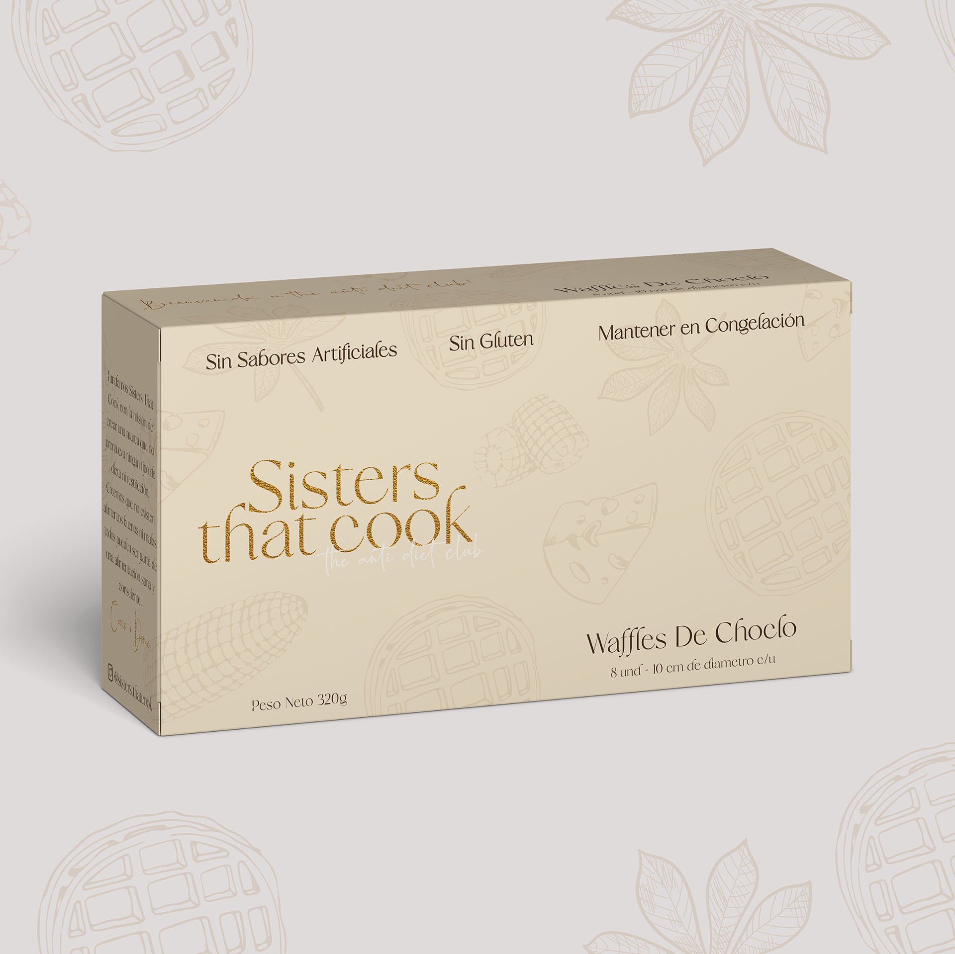
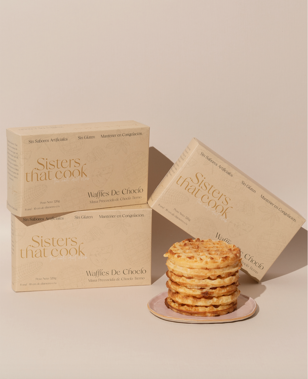
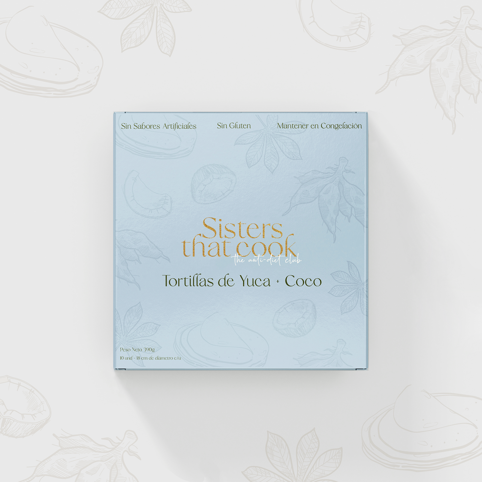
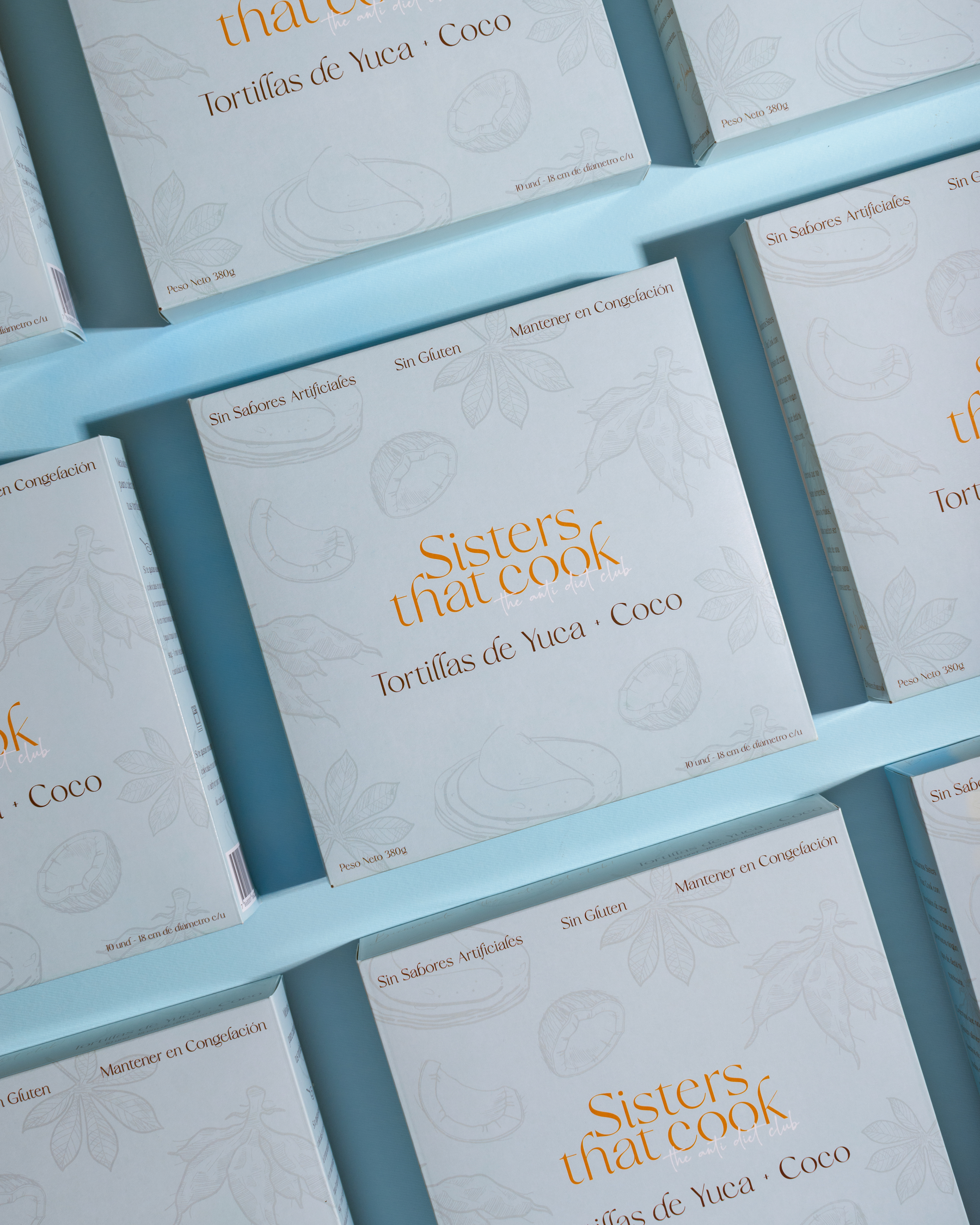
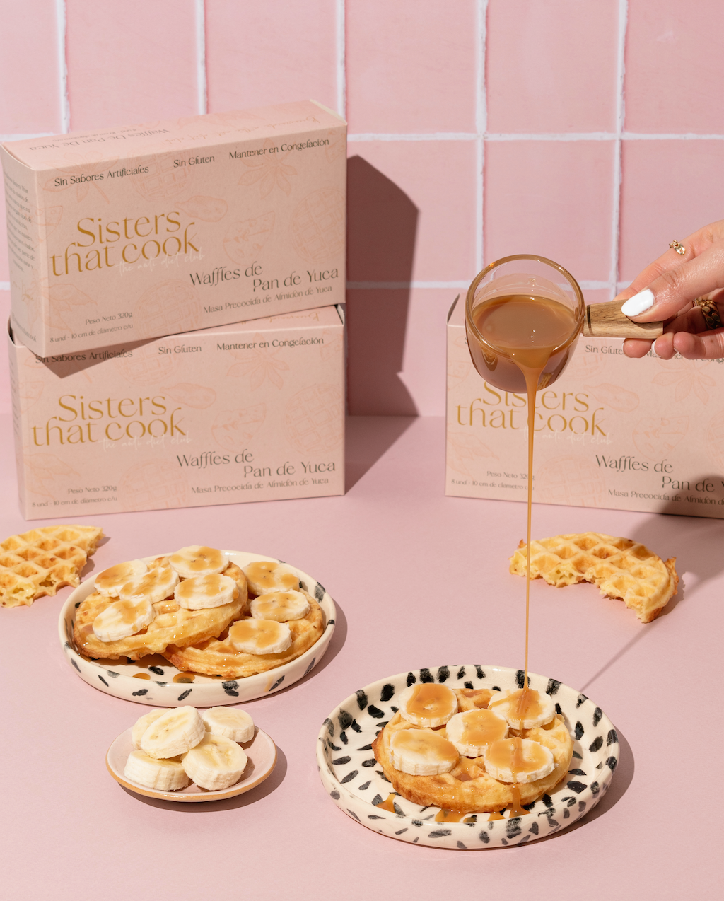
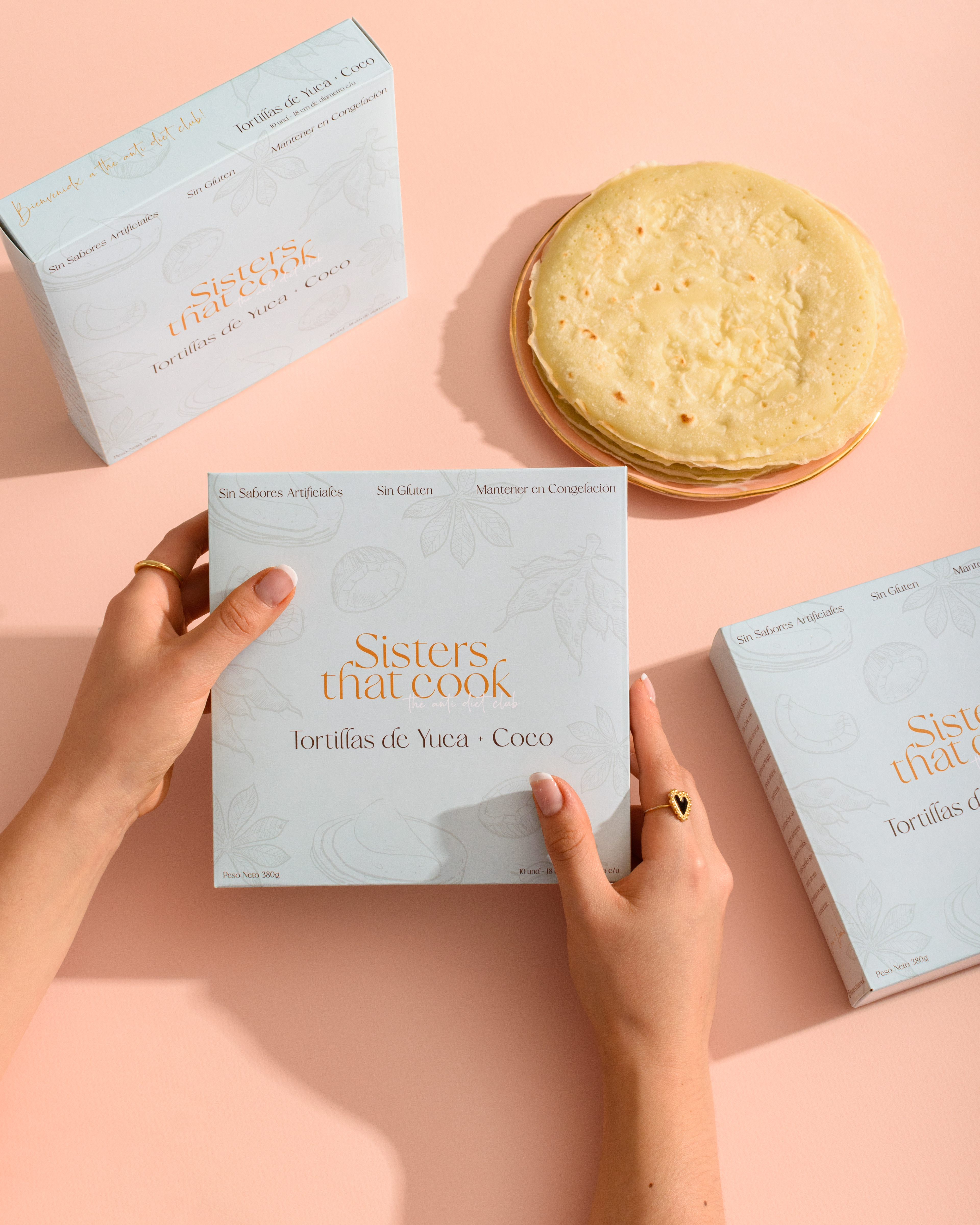
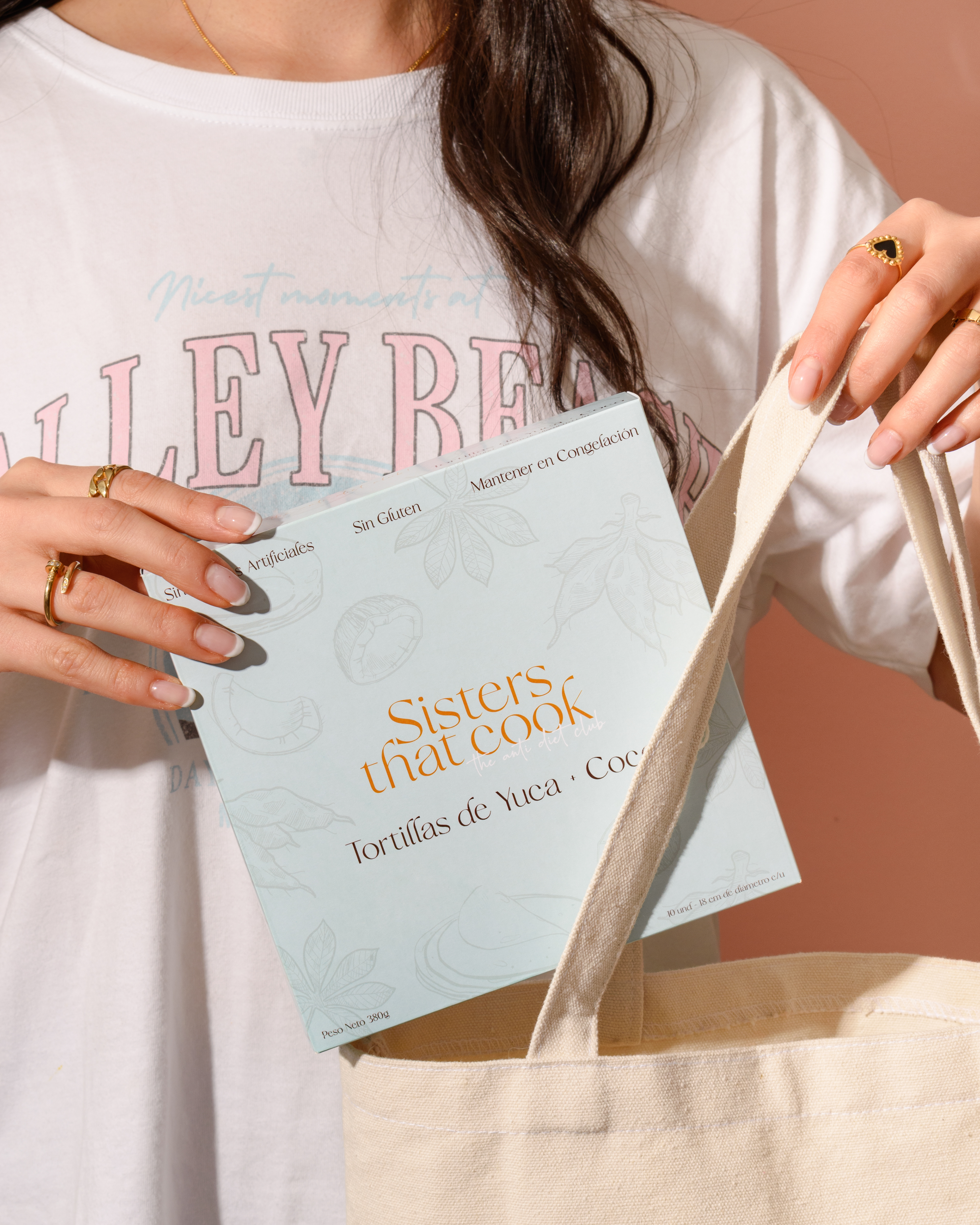
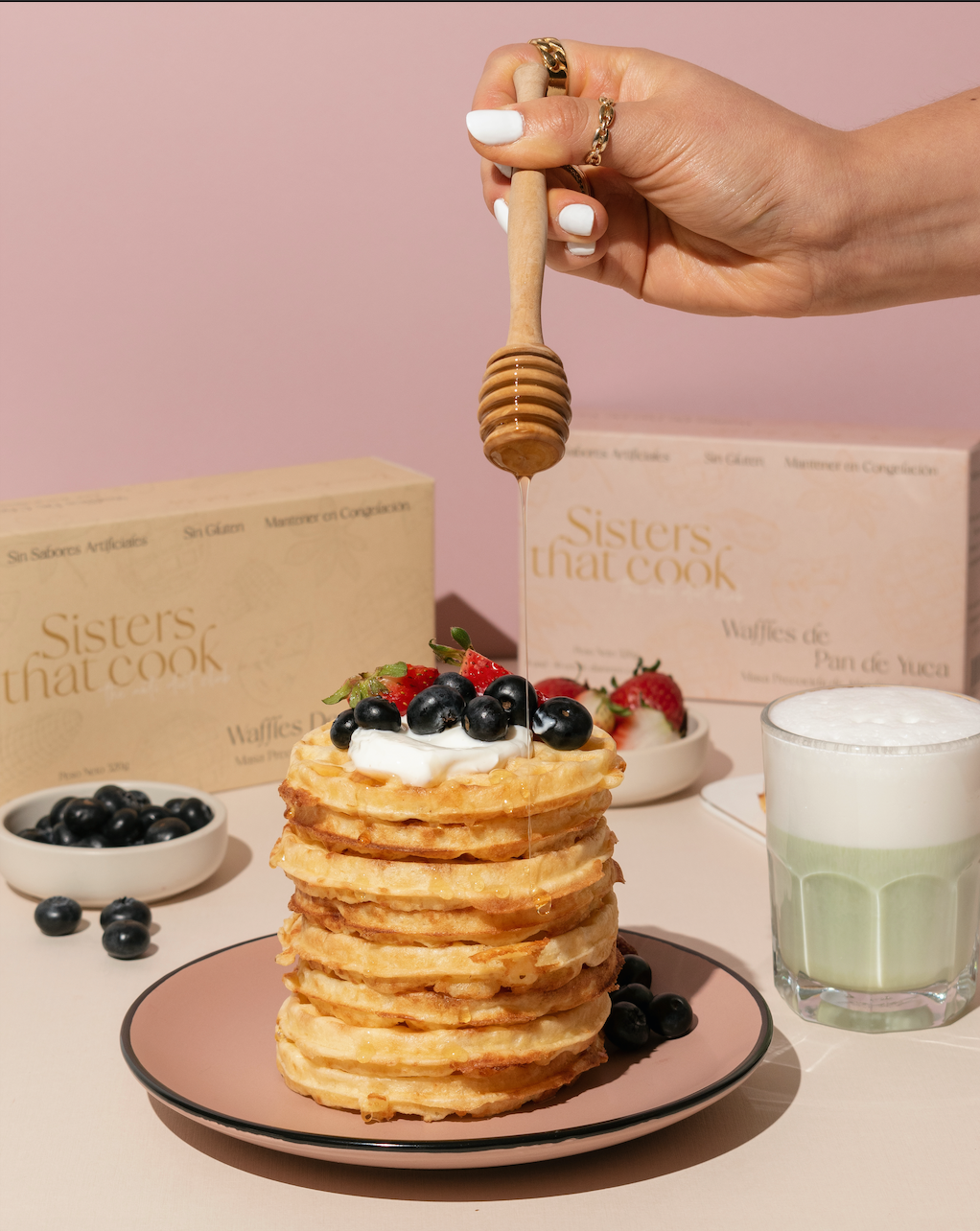
For the Sisters That Cook branding project, I developed a visual identity that strikes a balance between elegance and playfulness. By blending serif and script typography, the design feels both sophisticated and feminine. A soft pastel color palette evokes tranquility and sweetness, creating a harmonious and inviting aesthetic.
To highlight the brand’s simplicity, I incorporated minimalist illustrations of key ingredients like corn, cheese, and yuca. These refined elements keep the focus on the food while reinforcing the brand’s essence. The final result is a youthful yet sophisticated identity that perfectly aligns with Sisters That Cook’s vision.
Instagram: @sisters.thatcook
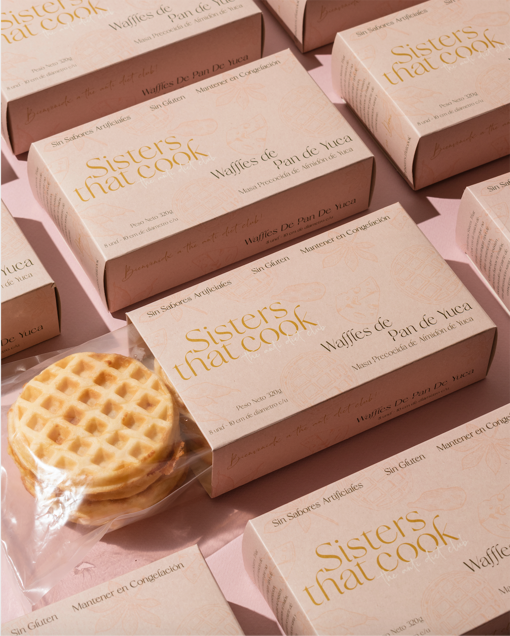
Disclaimer: I had no involvement in the production of the product photoshoot.