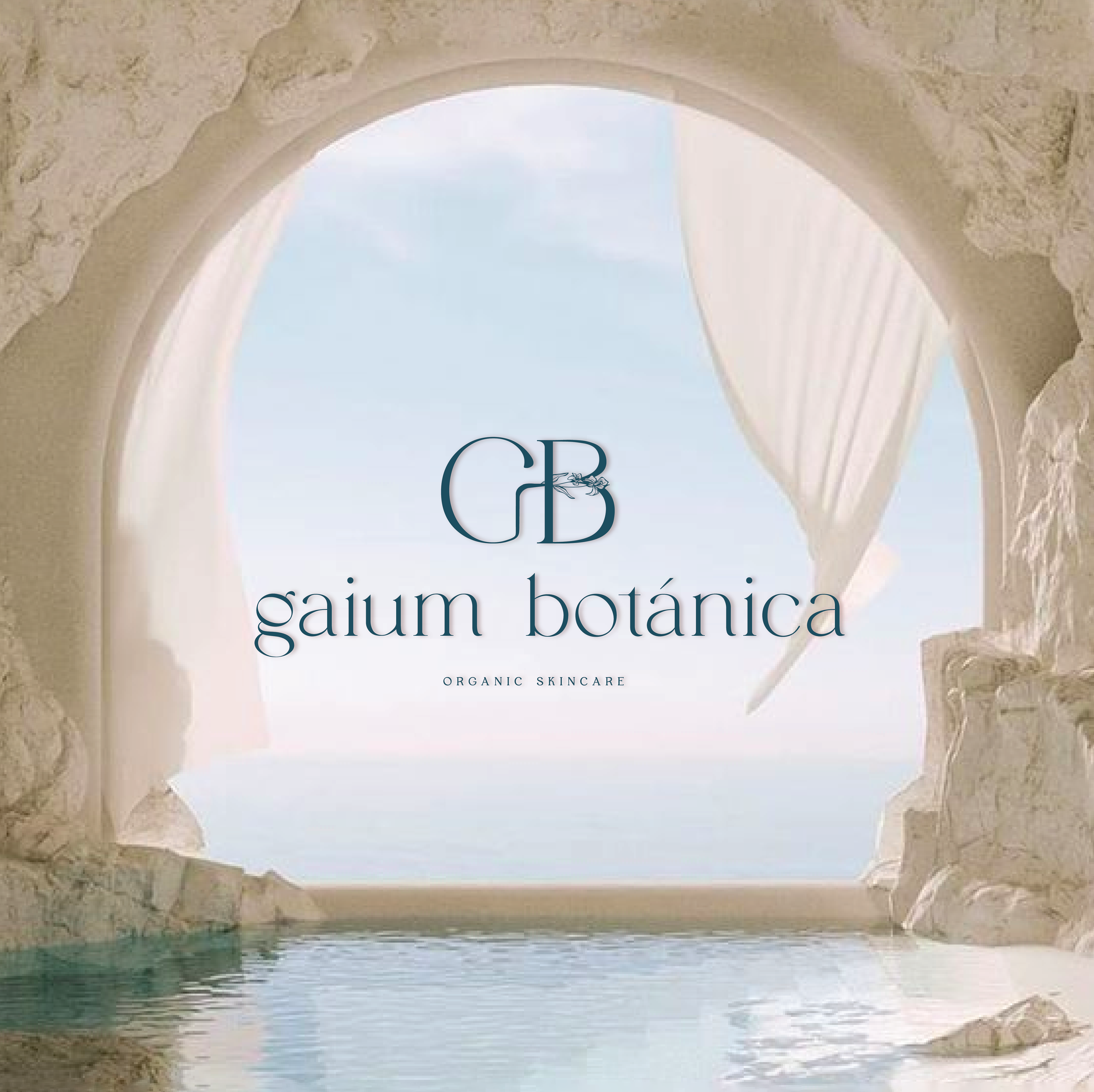
Gaium Botánica: Serenity Inspired by the Sea
Branding & Label Design
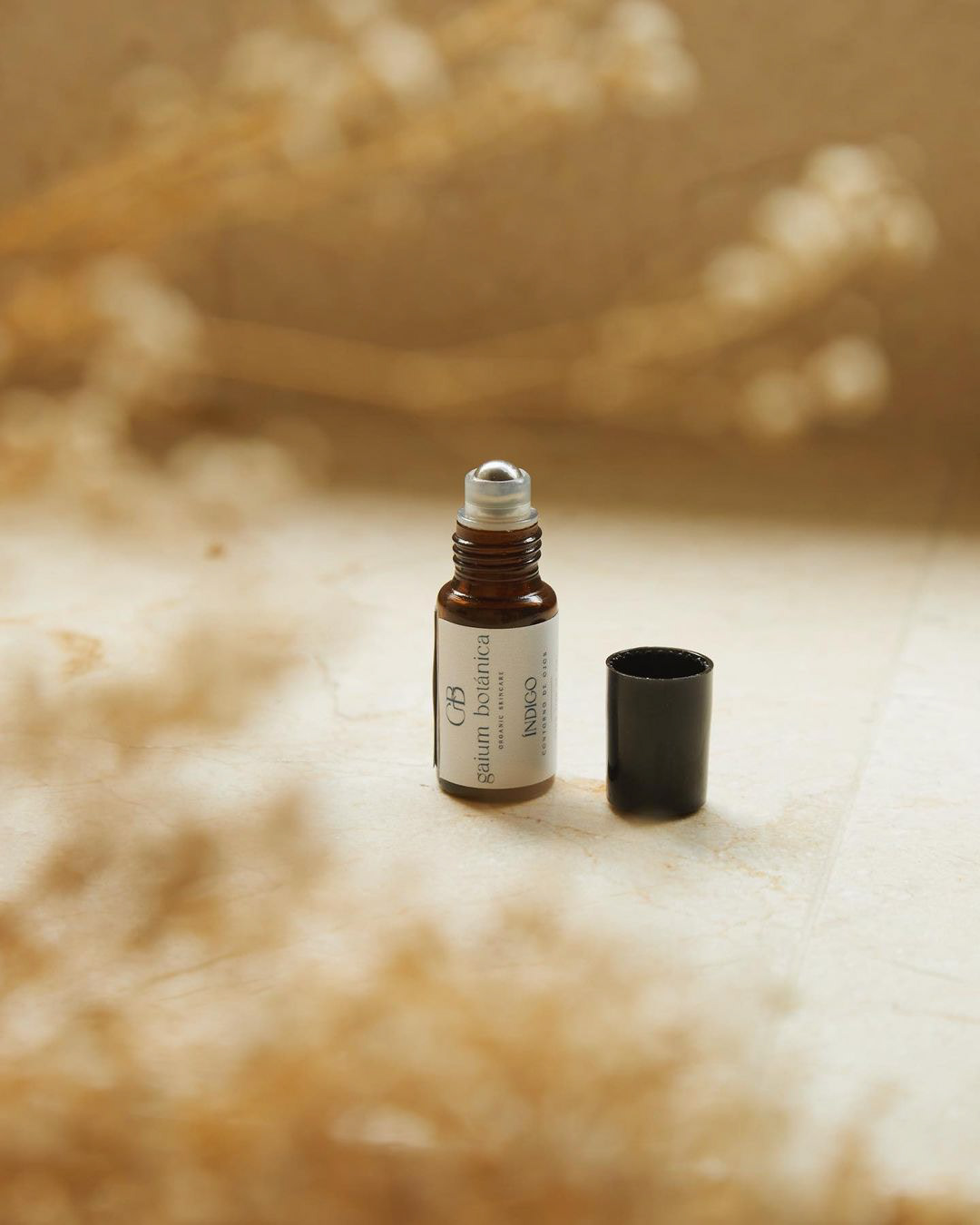
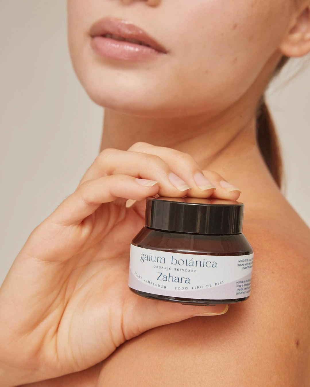
The branding and label design for Gaium Botánica, a Colombian skincare brand, draws inspiration from the French Riviera, the Mediterranean, and the refreshing essence of the ocean. The design incorporates the iris, the official flower emblem of France, into the letter mark, subtly paying homage to the brand’s heritage while adding an element of elegance and sophistication to the visual identity.
The overall branding evokes serenity, purity, and natural beauty. Soft, pastel colors, reminiscent of coastal landscapes and the Mediterranean Sea, create a soothing and refreshing atmosphere. The typography strikes a balance between simplicity and sophistication, reflecting the brand’s commitment to natural, high-quality ingredients. Through this design, Gaium Botánica conveys indulgence and luxury, staying true to its roots while offering customers a rejuvenating and enchanting skincare experience.
Instagram: @gaiumbotanica
Disclaimer: I had no involvement in the production of the product photoshoot.