Days Off
Rebranding & Packaging Design
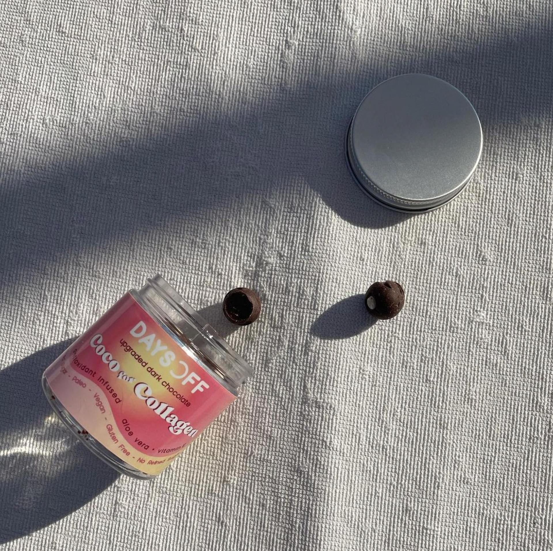
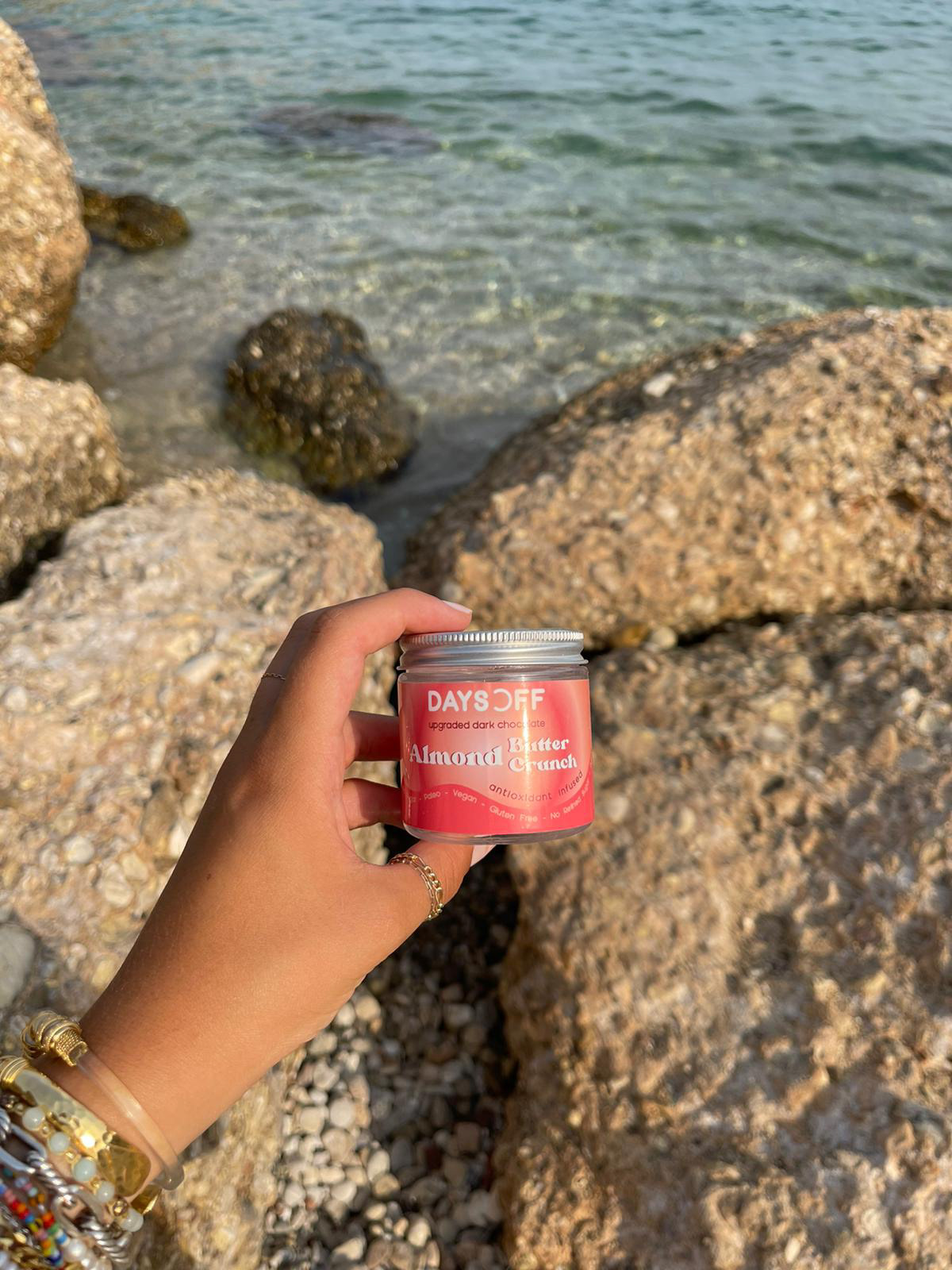
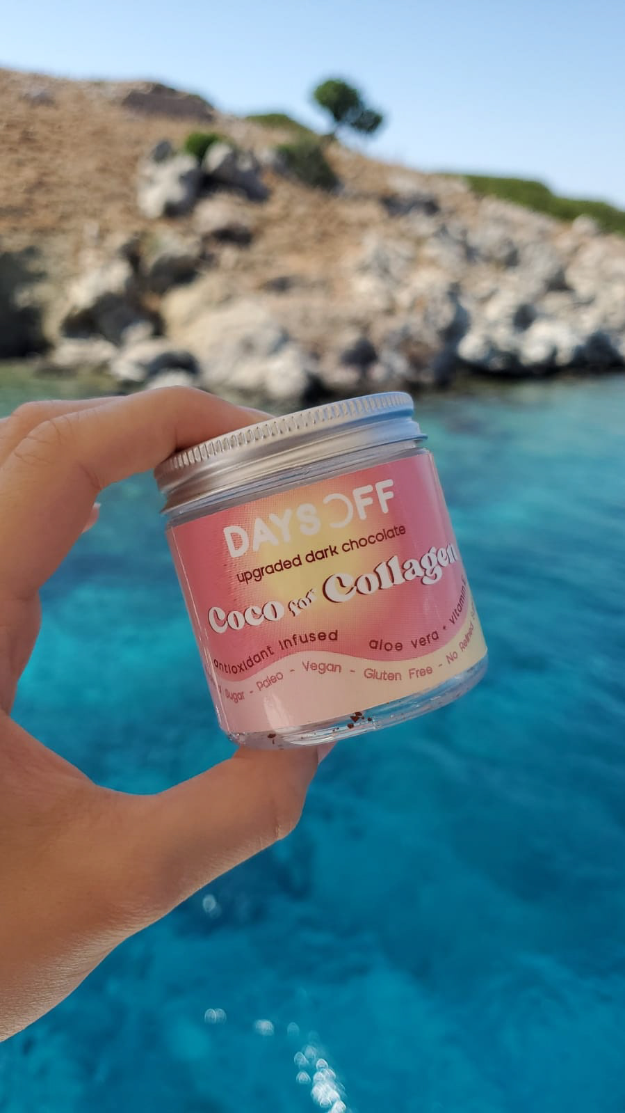
For sisters Joanna and Anissa, what began as a small chocolate business in their apartment kitchen evolved into Days Off—a brand built around the idea of taking a break and enjoying chocolate without guilt. Originally named WellWithYael, the rebrand aimed to capture this concept more clearly and create a stronger emotional connection with consumers.
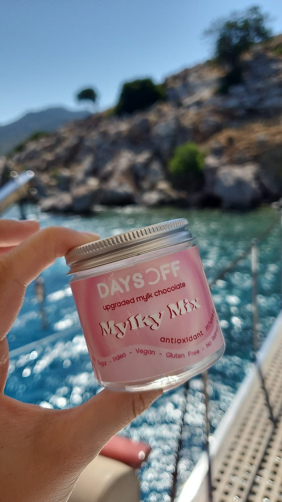
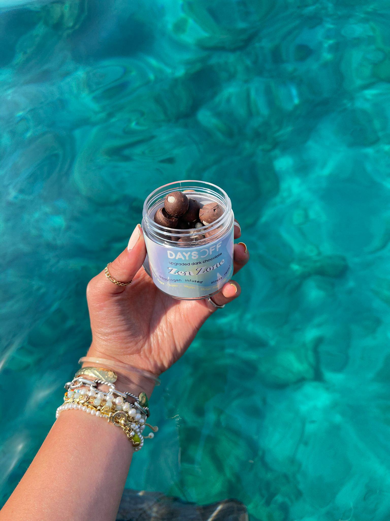
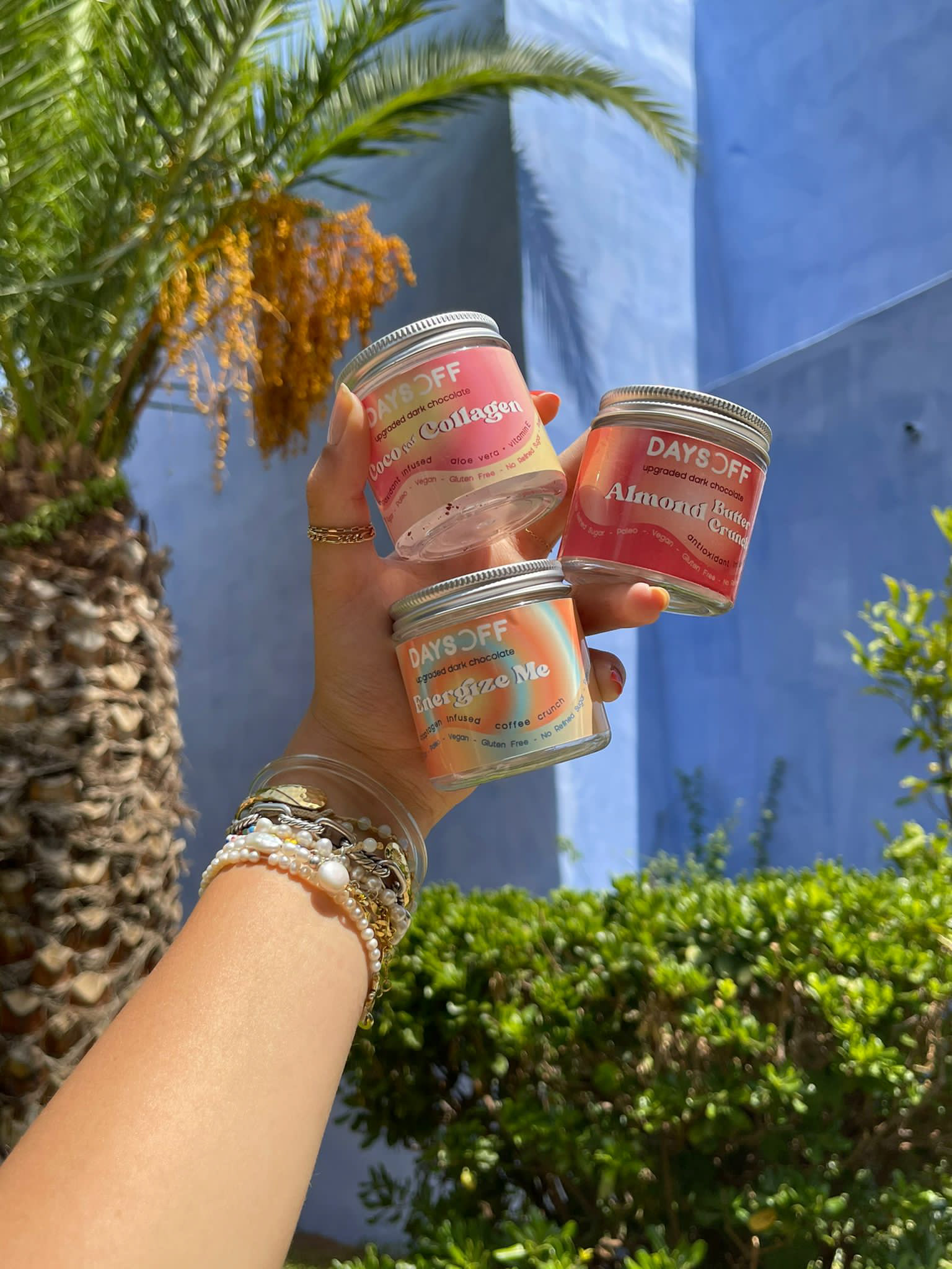
To bring the new identity to life, I introduced bright, vibrant gradients that transport customers into a surreal, indulgent escape. Each flavor was paired with a custom color palette to reflect its unique experience: Zen Zone, infused with adaptogens for stress relief, used calming shades of light blue, yellow, and purple to evoke tranquility, while Energize Me, featuring coffee crunch and lion’s mane, showcased bold, dynamic colors that communicate vitality and invigoration.
Through this rebrand, Days Off became more than chocolate—it became an immersive journey, inviting customers to savor indulgence while embracing the distinct effects and moods of each flavor.
Instagram: @daysoffbites
Disclaimer: I had no involvement in the production of the product photoshoot.