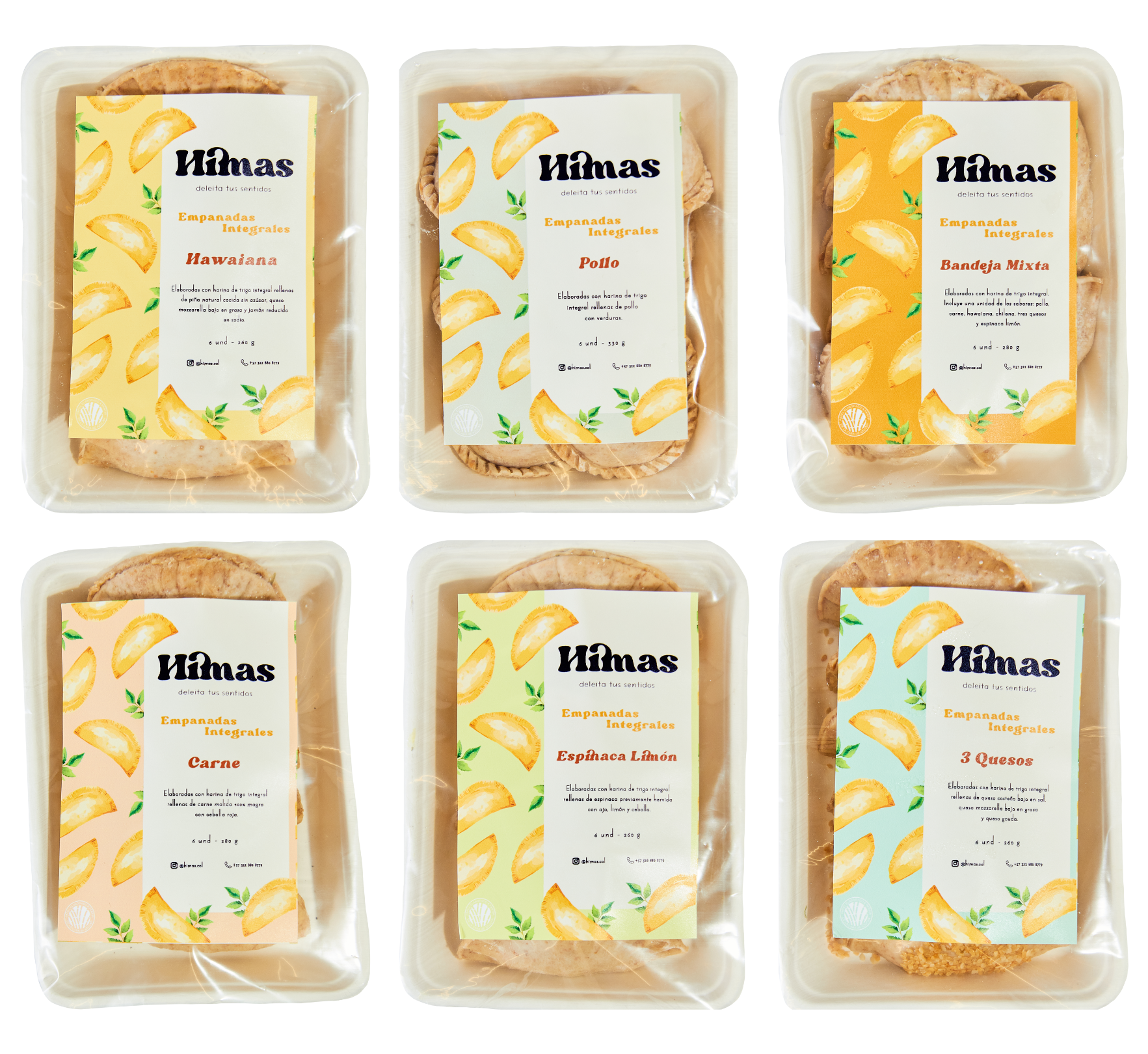
Himas: Evolving a Healthy Food Brand
Rebranding & Packaging Design
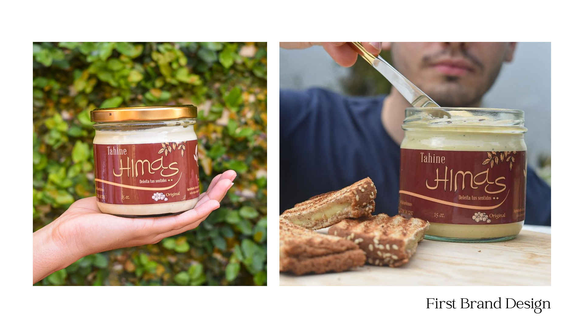
Himas is a Colombian healthy food business I’ve had the privilege of supporting since its founding. Originally centered around hummus, the brand’s first identity drew inspiration from Arab culture and the product’s origins, using deep earth tones and typography influenced by the Arabic alphabet.
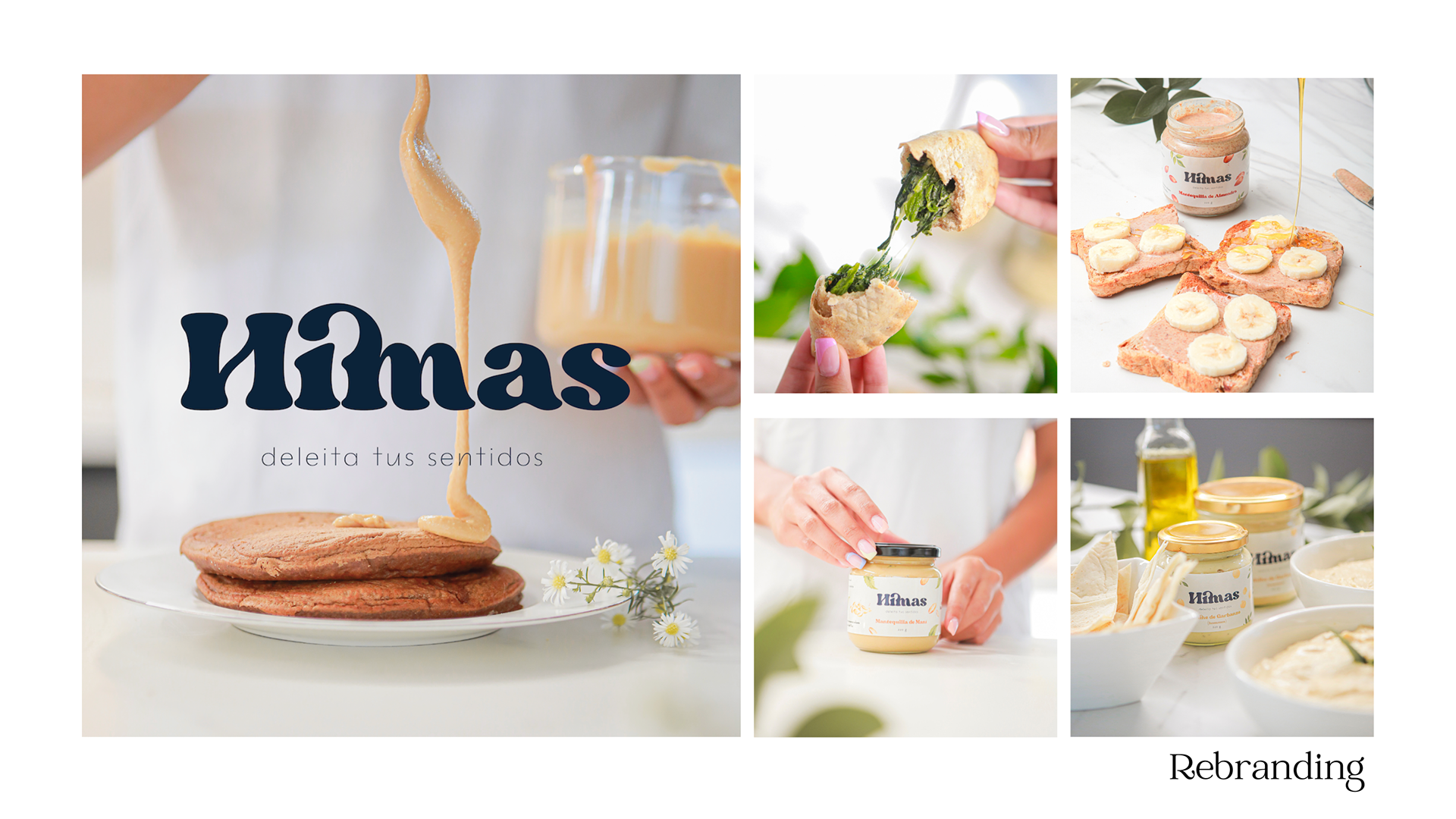
As the company expanded its offerings beyond hummus, it became clear that the original branding no longer reflected its vision. I led a rebranding initiative to create a brighter, cleaner, and more versatile identity that would communicate freshness and growth.
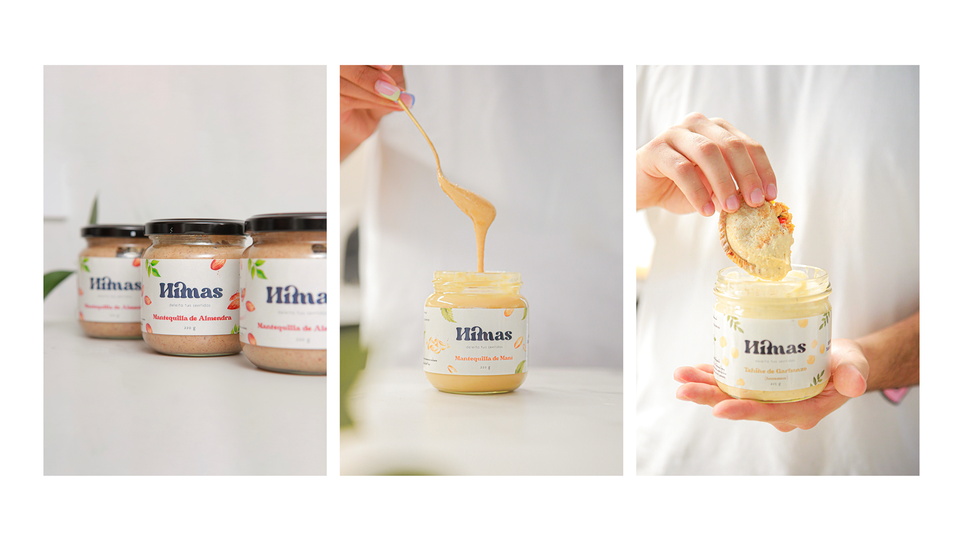
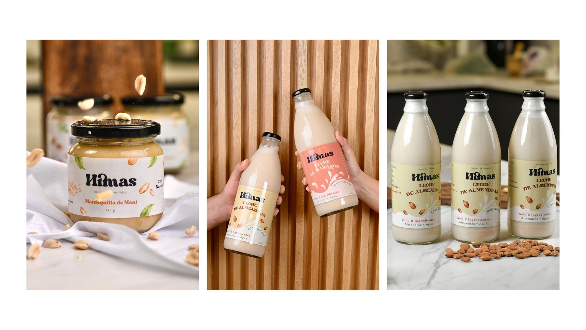
The updated design introduced a lighter background palette, allowing graphic elements to stand out. Watercolor-inspired illustrations of leaves and nuts brought color, vibrancy, and a natural touch, while the rebrand was extended across all assets, from packaging to social media.
This transformation positioned Himas with a renewed visual identity—one that celebrates its evolving product range while maintaining a modern, approachable, and health-focused aesthetic.
Instagram: @himas.col
Disclaimer: I had no involvement in the production of the product photoshoot.