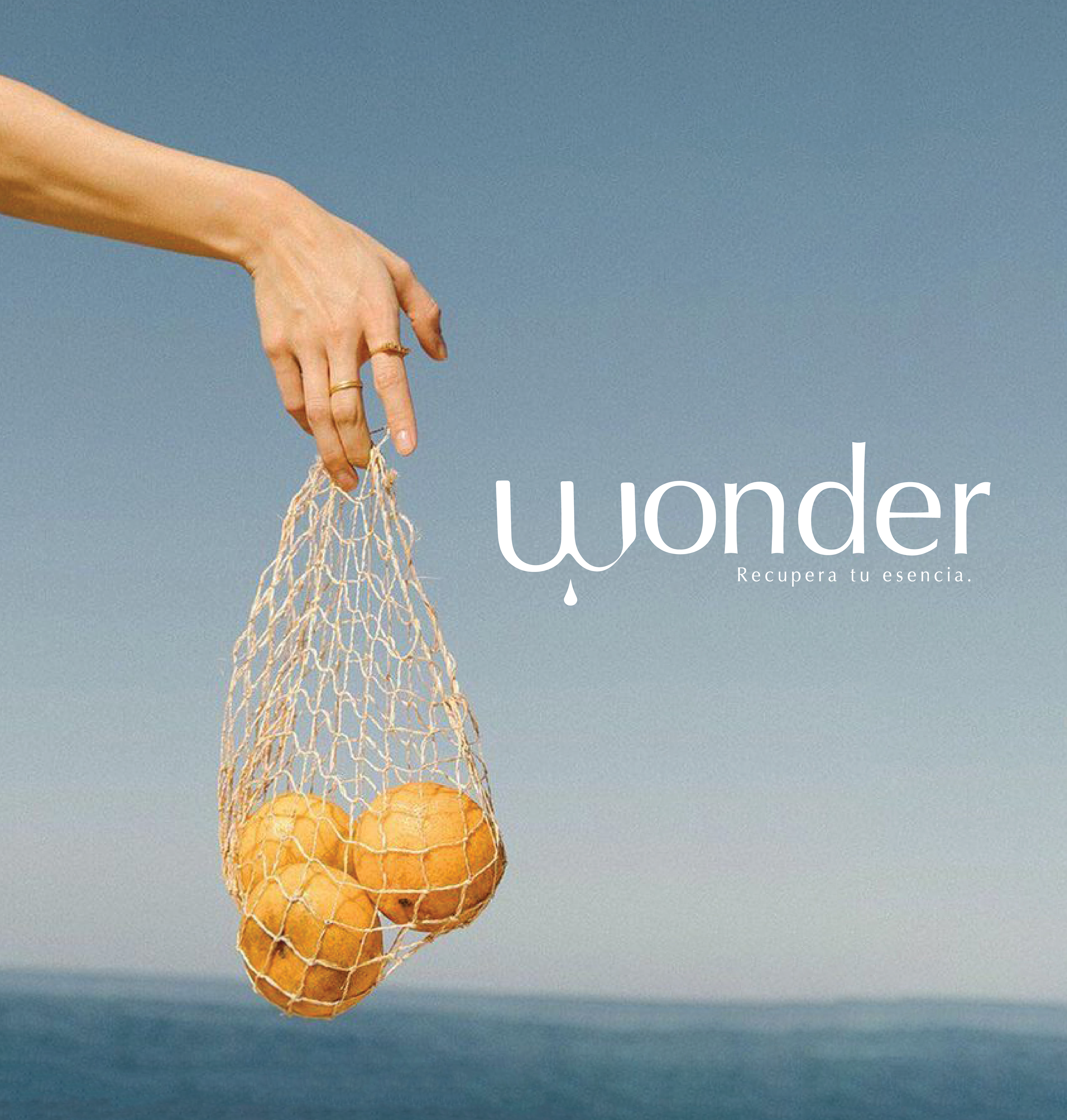
Wonder: Essential Oils for Harmony & Vitality
Branding & Packaging Design
Wonder is a passion project close to my heart. As both a designer and a consumer, I wanted to create a brand that embodies my love for essential oils. For the branding, I carefully selected colors inspired by nature, including blues, browns, and beiges. These colors symbolize serenity, simplicity, and purity, reflecting the essence of the brand.
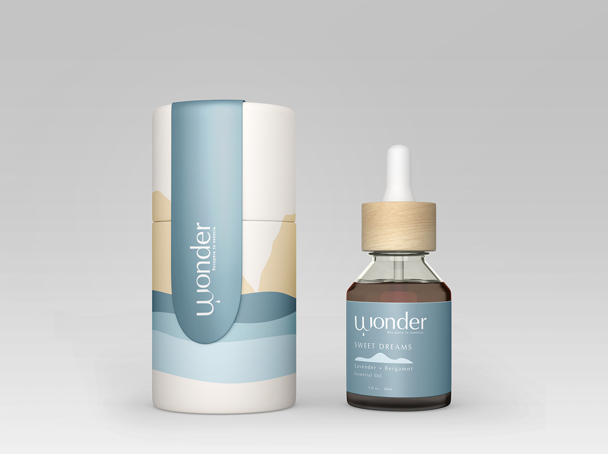
To bring a unique and distinctive touch to the packaging, I incorporated illustrations that complement the overall style. The "Sweet Dreams" oil, represented by soothing blue tones, evokes tranquility and serenity, capturing the feelings the product inspires.
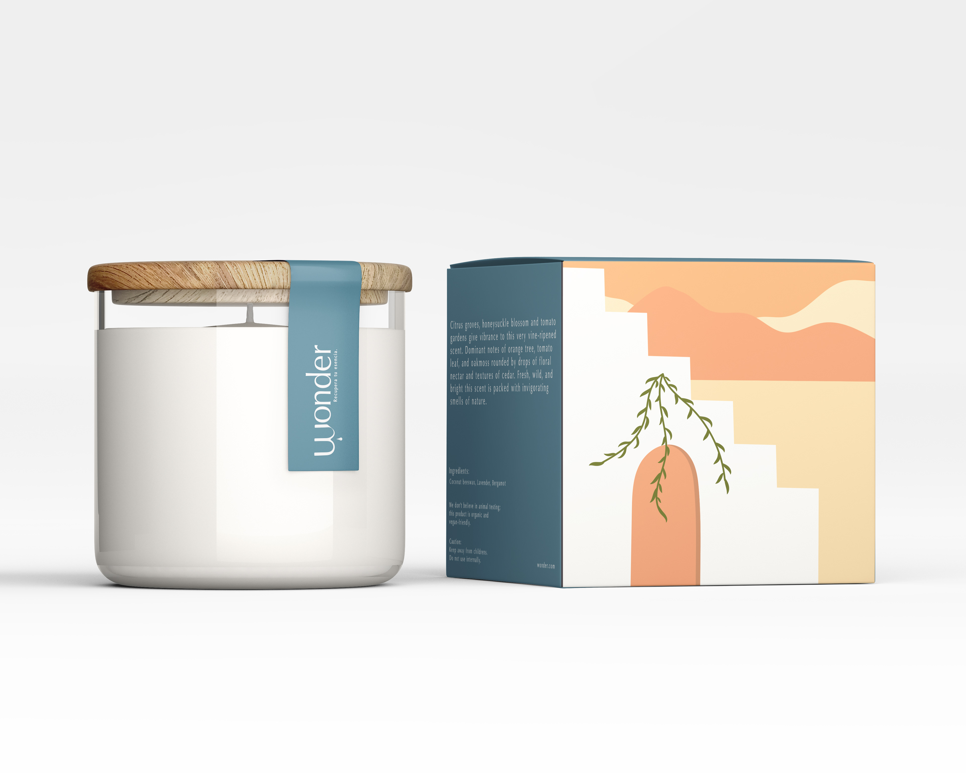
For the "Power Up" oil, I opted for earth tones, particularly orange, to symbolize the energy it provides. This choice maintains consistency with the brand's aesthetic while effectively conveying the product's benefits.
Wonder is a brand that aims to enhance well-being and create a sensory experience through essential oils. Through thoughtful design choices and attention to detail, I believe the brand conveys its message of harmony and vitality to consumers.